
Glitch Theatre
Setting the stage: Community-centred collaboration.
What we did
Strategic Facilitation, Brand Strategy, Naming, Messaging, Identity System

When 40+ stakeholders—D/disability-identified artists, board members, funders, and community advocates—shape every decision through iterative design sessions, the result isn't consensus. It's authentic alignment. The process became the proof: accessibility isn't accommodation, it's how you build something true.
For twenty years, Realwheels Theatre had been a force in Vancouver’s disability-inclusive theatre scene. But the name no longer reflected the work. “Realwheels” signaled physical disability, inadvertently narrowing public perception of productions that embraced the full spectrum of D/disability—visible and invisible, physical and cognitive, intersectional and complex. The organization needed to shift from being perceived as advocacy-driven to being recognized for artistic excellence. They needed to position themselves as seasoned theatre professionals who explore disability in their work, rather than as a disability organization that makes theatre. But the most significant complexity arose from the organization’s values: any rebrand would need to be built with community, not for community.


"This is resonant, tight rather than wordy. They took a huge amount of community input and turned it into something clear, elegant, and airtight. It doesn't feel like guesswork—it feels like a well-documented process we can stand behind."
Adam Grant Warren, Community Leader
We began with a fundamental commitment: community voice would shape every decision. Over nine months, we engaged more than 40 interest holders—D/disability-identified artists and performers, board members, longtime audience members, funders, theatre industry professionals, and community advocates. We designed activities that were culturally appropriate, accessible, and inclusive by design, working with American Sign Language interpreters, providing materials in multiple formats, and creating psychological safety for people to share experiences that carried personal weight. We assembled a project team that reflected the community being served, where board members, actors, writers, community members, and Glitch leadership worked alongside Wiseblood in genuine partnership.
Through iterative workshops, we collaboratively developed naming criteria: inclusive, professional, evocative, distinctive, and expansive enough to grow into film, VR, and other media. When we introduced “Glitch,” the metaphor proved transformative. A glitch is a moment when systems reveal themselves, when what should happen doesn’t, when disruption creates possibility. For D/disability-identified artists, this resonated immediately—the experience of navigating inaccessible spaces and of creative problem-solving born from necessity. As one community member noted: “We are the glitch in a system not built for us.”
The breakthrough came when we reframed what a glitch represents: not a flaw, but the spark of what’s next. This became the brand’s philosophical foundation. We developed positioning that navigated complex identity politics: “Our work is D/disability-led, not defined by disability, but shaped by it.” This language centred disability as a creative landscape rather than subject matter, a crucial distinction that opened doors with artists, funders and collaborators.


"Working with Wiseblood revealed just how crucial our brand is. Hearing our values and direction reflected back with such clarity honestly made me emotional. The emphasis on art, innovation, and artistic excellence—having this language behind us as we move forward is incredibly important."
Shawn Macdonald, Artistic Director
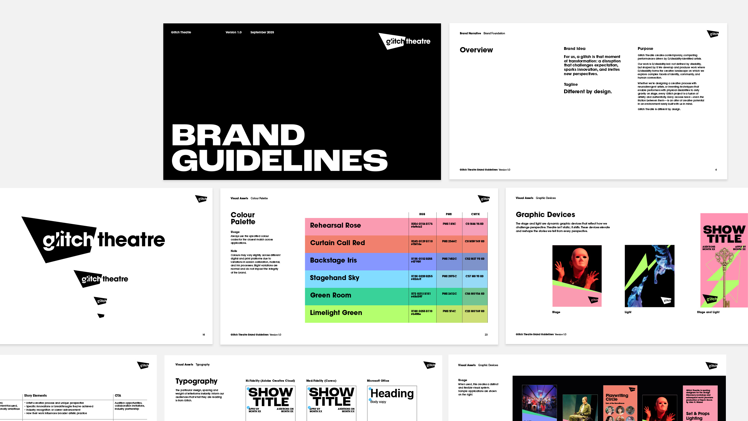
The visual identity made the glitch metaphor tangible. The logomark itself disrupts expectation: a bold geometric form that shifts and fragments across applications. Vibrant colours refuse neutral palettes typical of institutional arts brands. The typography balances high legibility with visual disruption. The colour palette draws from digital glitch aesthetics—electric pinks, cyan blues, vivid greens—signalling contemporary energy rather than earnest advocacy.
A name isn't a logo. It's a philosophical stance. When the community recognized themselves in the 'glitch' metaphor, that moment when systems reveal themselves, when disruption creates possibility, the rebrand became a catalyst.
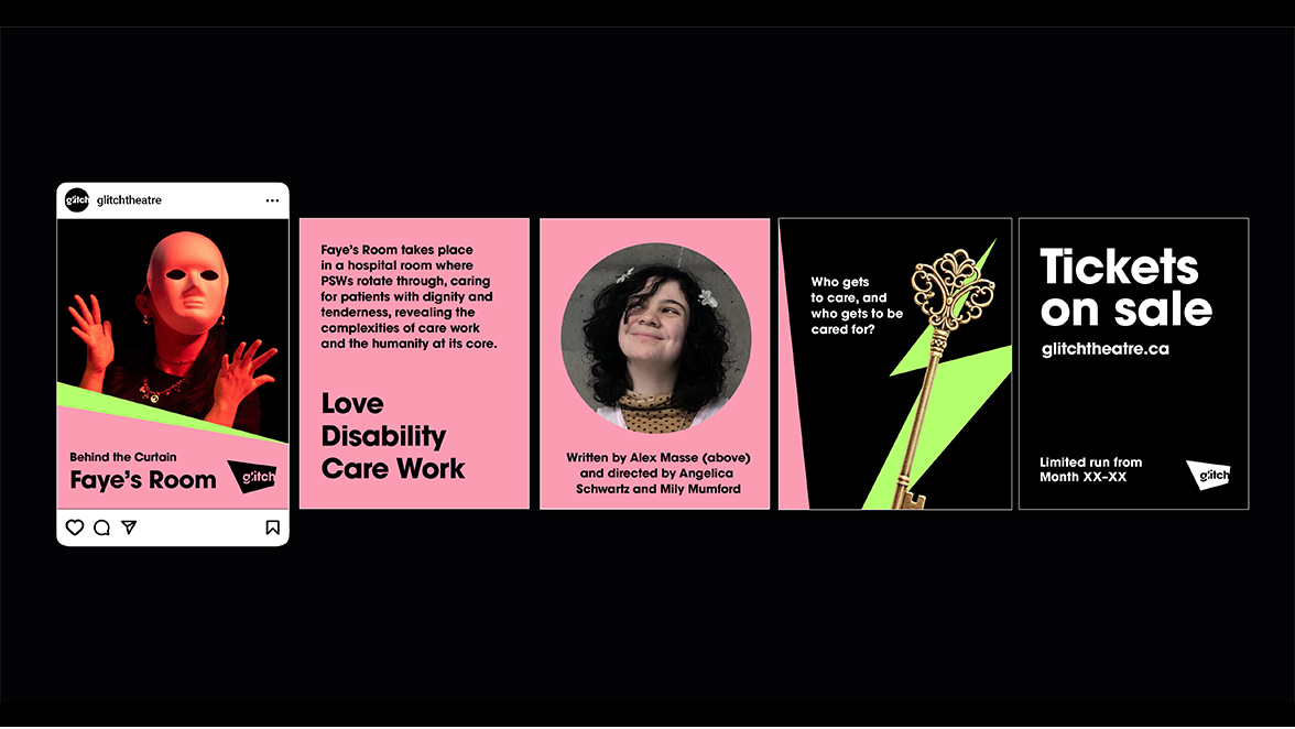
But the most profound shift was permission. The process didn't just give the organization a new language. It reinforced their desire for bold change and matched their artistic ambition with a brand built for it. The rebrand became a declaration: we are professional artists, production designers, actors, writers working at the intersection of disability and artistry. This energy carried directly into their first post-COVID production, Faye's Room—an acclaimed exploration of neurodiversity and creative practice that embodied everything the new brand promised.